
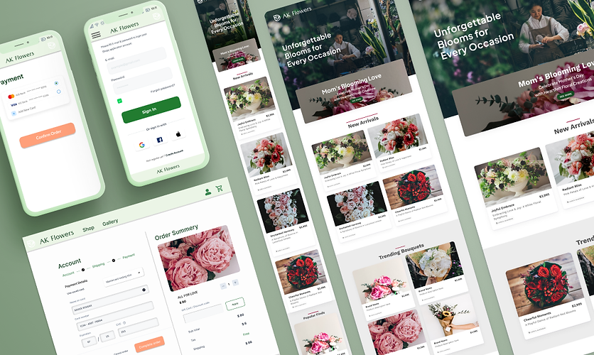


Key Considerations
for Building Responsive Websites
レスポンシブサイトの作成要点
フレキシブルなグリッドレイアウト:
画面サイズに合わせて自動的にリサイズ・再配置されるグリッドシステムを採用しました。
ブレークポイントの使用:
メディアクエリを使用して、さまざまなデバイスや画面サイズに応じて適切なレイアウトを適用できるよう考えました。
モバイルファーストデザイン:
モバイルデバイスを最優先に考慮してデザインをおこない、次にタブレットやデスクトップに対応するように拡張しました
タッチフレンドリーなインタラクション:
タッチデバイスでの使用を想定し、ボタンやリンクのサイズ、タッチ領域の最適化を考慮しました。
パフォーマンス最適化:
画像やCSS、JavaScriptの最適化、遅延読み込みなど、ページの読み込み速度やレンダリング速度を向上に努めました。また実際に多数のデバイスで、テストを繰り返しました。
Flexible Grid Layout: I adopted a grid system that automatically resizes and rearranges according to screen size.
Using Breakpoints: I used media queries to apply appropriate layouts depending on various devices and screen sizes.
Mobile-first Design: I prioritized mobile devices in our design, then expanded to accommodate tablets and desktops.
Touch-friendly Interactions: Considering touch device usage, I focused on optimizing button and link sizes, as well as touch areas.
Performance Optimization: I strived to improve page load and rendering speeds by optimizing images, CSS, and JavaScript, as well as implementing lazy loading. I also repeatedly tested on numerous devices.

